My favourite photos
These are my favourite photos because I think that these really represent my personality.....I love taking photographs of buildings, animals, patterns, nature and out of focus photographs. I have chosen these in particular because they fit the my aim of taking the photos and I am really proud of how they have come out. Most of these were taken on my phone but others, like the moon were taken in a Nixon digital camera. I love taking photos on my digital camera because of the zoom that the camera lens can capture and the amount of detail that it can show. One of the photos that is in black and white was one that I took ata concert and edited because I like to have monochrome photos aswell because it makes me feel a sense of nostalgia when looking at it.


Photobook Analysis
In this photobok called 'Ordinary Fragments' by Tyrone Williams and Jean - Christophe Recchina, which contains 111 photographs, I have taken photos of some of my favourite images in the book which really interested me. The dark layout of the frame makes the vibrant colours in the images stand out even more. I really liked the composition and patterns in the photos which were bought out by the light in different positions.


This photo book is about difficulties we experience and understanding our environment which is reflected through fences, windows, shadows and brickwork effect which also mirrors the urban world that we live in and the structure that our lives have and the way they move show the impermanence of this showing out difficulties. The cover design is very abstract but I like the way the red letters contrast with the black background. The design is simple yet gives the message 'OF2' meaning 'Ordinary Fragments issue 2' and also fits the entire length of the cover without overlapping or looking messy. The cover uses simple, primary colours and tones and use them to make the book stand out from others.
The composition of each photo and the way in which they are all interconnected together as well as the fact that the images go from a monotone/greyscale into more colours being apparent and visible really makes these photographs stand out. I think that the photos do communicate the message of the book as there are constant images of buildings, structures, structures with holes, sharp edges which indicate the difficulties and hardships that we face and reflects how sudden it could be in our lives. I think that at first there isn't a completely clear artistic vision, what i thought about the meanings of the photographs were completely different to what they actually mean. I had the view that the photos reflected life which does correlate with the main idea of the book:the struggles we face in life. But after finding out the meaning and taking another look at all the photos, the artistic vision became clearer to me as I could see the small details that portrayed the struggles in life. The work feels very aesthetically sophisticated as there is a clear running theme throughout the entire book and all the photos have something in common to show emphasise this. When researching these artists I had a look at some of their previous work from quite a while ago and then looking at this book, I could see how their photography skills have enhanced over a few years.
Each page reflects and compliments the photo on the opposite side which I've noticed is mostly by colour but also by composition and the subject itself which the photographers say is the "strength of the photo book". I really love that the book has a dark interior which is something different and unique from previous photo books that I have looked at. Each image does not fill the entirety of the page and the black border around each image contrasts to the vibrant, bright colours and hues in the photographs itself. The few that do pan out into the whole page give the book a switch from the page layout in the majority of the book. The placement of the photographs are clearly a conscious choice as the two photos on each page always have something in common that brings them together and connects them. I think that at first glance there is a visible logic to the design of the spread and presentation of the images because they contrast each other e.g have opposite/clashing colours like blue and pink, black and white, red and yellow.... If two images on the same page. both have frames/borders around the photo, then the borders are different tones : black and white or the image will be a similar patter to the one next to its' frame. This is something that really intrigues me. The layout of the book feels very modern and the cover is very abstract which only made me wonder what the inside would be like and I personally don't feel as if the design or layout would ever be 'outdated'.
After viewing the book, the contents really stuck with me for a while and I've found myself - since I looked at it - thinking back at the photos, the colours and how well all the images fit together. The composition of the photos are simple - the overlaying of two photos and yet I was so intrigued by what the photos were of. I was in love with how they looked but I needed to know what they were actually of: a broken glass with light reflecting off the glass, something colourful maybe clothes behind a designed glass/window, the floor/pavement whilst raining with lights reflecting on the rainy ground. I was more interested in the fact that the subject was so simple and yet the colours and reflections of the light enhanced the subject and emphasised more details and made me see the images more in depth and I really want my response to make others look at them the way I looked at these images. In my response, when displaying my photos, I want to have them in different formats so that they don't all look uniform and boring. Having them in displayed differently, different sizes, will give them more depth and won't be the same as any other photo taken. Like in the photobook I want all my images to have at least one thing in common that connects them all together.
First response...


WWW: I really like the colours and composition of the photos, the blurry photos and how the colour is dragged across the image. I really like taking blurry photos like these.
EBI: There were more photos that displayed imperfections around me, that I see all the time.
EBI: There were more photos that displayed imperfections around me, that I see all the time.
Bertrand Cavalier: Concrete doesn't burn
One might think that my presence could have an influence on what’s happening, however, getting to know each other helps to keep things natural. It’s important to not behave like an observer but rather as someone who’s joining the moment.
In this photobook, Cavalier explores the interactions between people and their environment. He 'creates poetic renditions of singular moments rather than objective documents of social phenomena'. The intention of the book is to share thoughts about about how history is lying within architecture and familiar aspects of urban spaces . The book reflects the architecture in cities and the impacts that they have on the people living there. Cavalier explains how this differs in each city photographed. For example, Rotterdam which was heavily bombed during WWII so everything had be rebuilt as well as the city being a very modern one who take architecture very seriously. The conclusion was that each place is unique and the final perception belongs to the viewer and to make their own mind up.
Many of the images in the photobook display 'model towns' built as military training grounds. Cavaliers focus isn't only the places but the the failure to convey anything about history or about the lives that pass through the cities constantly. This book depicts the contemporary city as a space that is waiting for a different meaning to take over . Throughout the book, Cavalier investigates how 'political upheaval' becomes prominent in urban landscapes and how this therefore affects the lives of the people who live in it. Many photographs in the book are of places that have been marked by armed conflicts in the past. By photographing people who live in these areas as well, he shows the readers of their connection to the environment and how this architecture affects them.
The monochromatic medium of the book.emphasises the rawness of the photographs and makes certain points in the images stand out and also gives connotations of nostalgia and the past The black and white format blurs the line at what sort of photos we are looking at and distorts our perception of time frames when looking at these images. Cavalier says that he chose the format to be in black and white because it feels like getting rid of unnecessary details so that the main focus of the photo can stand out and be obvious to an implied audience who are looking at his book. When I looked at the book, the monochromatic format of the photos did make the subjects of the photos stand out but also made me wonder when exactly the photo was taken as monochrome usually brings to mind past events.


Kidbrooke Dérive
Dérive is a french word for moving through a city or space - aimlessly wandering around and to be able to do this, you need to walk around without a specific destination and take in the psychogeography "(the way different spaces or environments make you feel and behave – as well as the people, buildings and changes in atmospheres)".
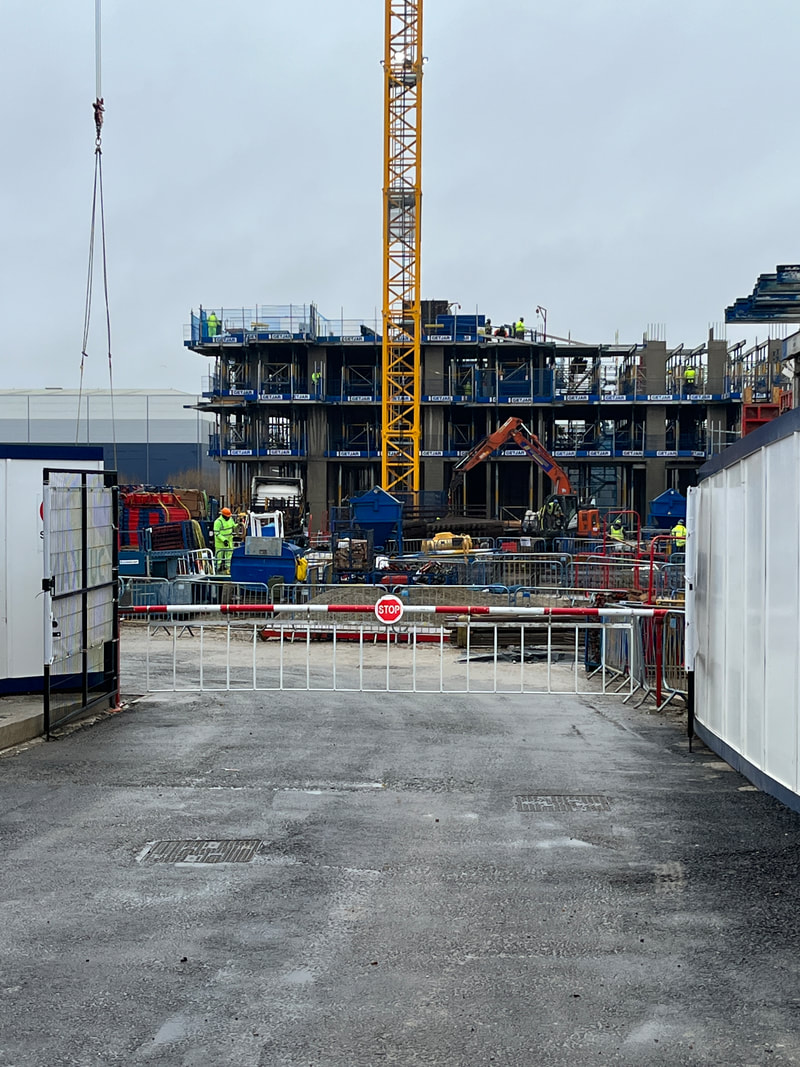
Today, we went on a dérive around Kidbrooke - our local area - and we took photos whilst walking around. It was raining which made it a bit harder to take photographs the way I wanted to but I think that this made me look for different things to take photos of. I walk through Kidbrooke every day to come and go to school so I know the area quite well and I see the same things, same buildings, people every day.....But this helped me to go out of my comfort zone and to take photos of different things that I don'y usually take photos of and to look around at a variety of objects, places within Kidbrooke that I don't usually go to. There is a lot of construction work taking place in Kidbrooke right now which I documented in some photos and managed to capture.
For this dérive, we went as a whole class and took turns leading the way. As we didn't have a specific destination, we went wherever we wanted to and to take photos while we walked. I found this different to how I take photos for school as I have a specific destination and aim for my work but this made me look around at everything around me in more detail and take capture whatever I found was interesting and this helped me to look at everyday objects in a completely different way.
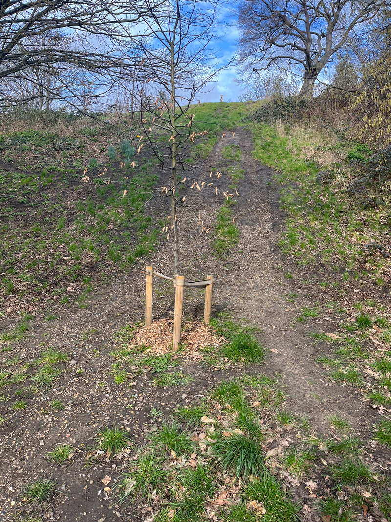
My favourite photographs that I took were mostly the photos near the end showing different shapes - with the water features which I always love and like to look at as I walk past it all the time. If I could go on this walk again I would go somewhere I don't usually go and I think I would find more interesting photos to take which may be what some people see everyday - like Kidbrooke for me.
Below are the photos that I've taken:
Today, we went on a dérive around Kidbrooke - our local area - and we took photos whilst walking around. It was raining which made it a bit harder to take photographs the way I wanted to but I think that this made me look for different things to take photos of. I walk through Kidbrooke every day to come and go to school so I know the area quite well and I see the same things, same buildings, people every day.....But this helped me to go out of my comfort zone and to take photos of different things that I don'y usually take photos of and to look around at a variety of objects, places within Kidbrooke that I don't usually go to. There is a lot of construction work taking place in Kidbrooke right now which I documented in some photos and managed to capture.
For this dérive, we went as a whole class and took turns leading the way. As we didn't have a specific destination, we went wherever we wanted to and to take photos while we walked. I found this different to how I take photos for school as I have a specific destination and aim for my work but this made me look around at everything around me in more detail and take capture whatever I found was interesting and this helped me to look at everyday objects in a completely different way.
My favourite photographs that I took were mostly the photos near the end showing different shapes - with the water features which I always love and like to look at as I walk past it all the time. If I could go on this walk again I would go somewhere I don't usually go and I think I would find more interesting photos to take which may be what some people see everyday - like Kidbrooke for me.
Below are the photos that I've taken:


WWW:The overall outcome of my photos despite the rain, buildings I managed to take photos of, the photos featuring water
EBI:I take more photos up close, zoomed in so the subject and surroundings aren't so obvious.
EBI:I take more photos up close, zoomed in so the subject and surroundings aren't so obvious.
Teju Cole: Blind Spot
Teju Cole is a Nigerian - American writer, photographer and art historian. His book "The Blind Spot" which he defines as the blind spot in our vision due to 'where the retina meets the optic nerve' but as I see more of the photos from the book the more the the blind spot definition becomes. This photo book is inspired by the fact that Cole went blind in his left eye and he found out that he had a rare eye disease called 'big blind spot vision'. This made him realise how much that we see everyday that we just take for granted. This syndrome inspired him to take a different approach to his photography. He says that this made him look more 'patiently and intently' which in effect caused him to produce more 'meditative and mysterious' photos which he then documented in his book 'Blind Spot'.
The photographs in this book are from his travels around the world and the short paragraphs by the photos are his meditations of them. They include photos from 5 continents, nearly 20 countries and more than 60 different locations.
In each description, Teju Cole describes how we see and how we experience visual memories and how these connect to outside details in our life. The culture of the photos differ in each one as we are seeing his travels in the world and all the different places that he has been.
Most of the images are in colour and although most are simple, things we may see everyday, they are empowered by his thoughts recorded next to his photos. The format of the book is designed for the reader to take in one photo at a time before moving on to the next one and the format of the photo with its location and paragraph on the page beside helps the reader to focus on one photo at a time and to analyse the photo the way we see it whilst getting insight on Cole's own thoughts and feelings about his photos . His use of dialogue and personal reflection only proves to us that regardless of aspects that differ everyone from another, some aspects of life remain constant. He makes a deliberate choice to exclude themes from his book, a lot of his passages bring to mind the theme of spirituality and the way we see things - different to others.
Although losing his sight, he used his camera as his extended memory. A lot of his photos display non - urban, quiet images and his descriptions reveal the 'moral truths hidden from sight'.
Below are some of his images from the photo book 'Bind Spot':


Below are some photos that I have taken which are inspired by Teju Cole's Blind Spot. I have tried to take the approach that we see so many things daily and take advantage of the fact that we have vision. I found that I focused on a lot of imperfections that I see which I will continue to do in my response:


Greenwich Dérive
Due to the Kidbrooke Derive which we did as a whole class, I went on a derive in Greenwich and took photos of my journey there and where I walked around. I found the derives really helpful and changed my mindset as I was taking photos of some things that I've seen before but have a different meaning that the last time that I just walked past them and payed no attention to it.
This derive was similar to the Kidbrooke one in the types of photos that I took, architectural and nature. I especially loved taking architectural photos as there are so many different angles that I can take photos of and makes them all look different.
This derive was similar to the Kidbrooke one in the types of photos that I took, architectural and nature. I especially loved taking architectural photos as there are so many different angles that I can take photos of and makes them all look different.


WWW: The photo oppotunties that I took advantage of by taking photos of nature, buildings, inside shops and the everyday natural in the moment style of the images.
EBI: The photos showcased more colours and some were more zoomed in.
EBI: The photos showcased more colours and some were more zoomed in.
Making Day - Dérive
|
In today's making day. I left school at 9:30 and took the train from Kidbrooke Station to Victoria Station. From there, we walked past Green Park, through Hyde Park and then to Oxford Street where we walked around and took some photos in a couple of shops: Adidas, Boots and some others. I took photos on the walk throughout and I took a mix of photos which were architectural and I had a variety of photos which had lots of colours and others which were dark and almost monotone due to the rain which we walked through all day. Although it was raining, I did enjoy the dérive and walking across Central London. The element of rain chanaged the way my photos would of come out if it wasn't. I really loved how some of the photos are darker and have darker colours in them as contrasted to other photos which have bright and a variety of colours in them.
|
|
We chose to go to Oxford Street because there were more photo opportunities there and we had 3 hours so we could make it there and back in time and considering the time constraints that we had to be back at a specific time, we did walk to a lot of places and take advantage of the scenery and business of the location but near the end there was a slight panic that we would not get back in time but it all worked out and I took over 36 photos and then narrowed it down to my favourite 36 photos.
What I liked the most about the dérive experience was the walk even though it was raining because the photos had a different effect to them as it was raining and added a different style to the photos that I normally take when it isn't raining but this is also what I found most challenging because the rain made the process of taking photos a bit harder because I struggled a bit with the lighting and the angles but I decided to take advantage of this and use the different lighting to be showcased in some of my images. Most things worked in this dérive worked
What I liked the most about the dérive experience was the walk even though it was raining because the photos had a different effect to them as it was raining and added a different style to the photos that I normally take when it isn't raining but this is also what I found most challenging because the rain made the process of taking photos a bit harder because I struggled a bit with the lighting and the angles but I decided to take advantage of this and use the different lighting to be showcased in some of my images. Most things worked in this dérive worked


My favourite 36 images:
Dérive #4


Richard Learoyd
In this recorded interview with Richard Learoyd, he begins speaking about what a photographer is and he explained it as someoone who takes a photo and the question isn’t where, it’s when because the lighting is so important in a photographic process. Also the decisions that we have to make when taking photos and having exhibitions. He decided to separate his photos of landscape, portraiture and still life and he found that this was perfect in the way that they were presented and his exhibition was a whole gallery of his own photos which is unusual as there are usually a couple of artists work at exhibitions. He also talks about how some photos are placed and where they belong for example his flower photos which he says belong as the conclusion, they couldn’t be at the beginning and I find this true because when arranging my photos there are some photos which fit perfectly into the different stages of the final gallery and look best in those positions.
Tabitha Soren
In Tabitha’s relief project she takes photos and then uses tools to change and alter their appearance by adding textures to them. I really love this idea as I like to use tools like scalpels and photoshop to change photos and merge them with others , so I’d really like to make a response which uses the idea of adding textures and patterns to my photos . Soren says the reason she does this is so people can see her hand in every photograph and see that there’s an experience of actually making them and turning your photographs into 3D. There are also a lot of decisions that have to made in this photographic process, like where to cut the photo, where to burn it or paint or shoot it. These unseen, unacknowledged background elements of what makes her photographs into the final piece -cutting, disintegration - sometimes go unrecognised as the process and thought behind the final piece is something that most don’t notice straight away when seeing a photo for the first time. When I first looked at Tabitha’s work, I thought some in the ‘Relief’ series had been photoshopped but upon looking closer and watching this video I gained an understanding into the work , effort and process in which made the final 3D piece look the way that it does. This understanding allows the audience to’ make the emotional connections based onto their own path’.
The goal mentioned in the video was to create something new from destruction and from the landscape which surrounds us everyday which we are used to and this gives the photographs in the collection a much deeper meaning and inspired my response which I will print out my photos and use tools like scalpels and paint and sharp edges to transform my photographs which convey meanings and perceptions behind them .
My response


WWW: The colours and different landscapes I managed to photograph and the variety of times the photos were taken at.
EBI: I printed them out and used tools to change and alter the way they looked like Tabitha had done. Change settings to make photos more in focus.
EBI: I printed them out and used tools to change and alter the way they looked like Tabitha had done. Change settings to make photos more in focus.
Hélène Binet
Hélène Binet is a Swiss French architectural photographer who practiced both contemporary and historical architectural photography. Her photography is mostly done in black and white and they really emphasise and show the sculptural elements by her contrast between straight and curved 'surfaces' and how they look mixed with the light and shadow - the interaction the subject and exposure factors play out in the photographs. The photographs Her work is often in galleries and exhibitions and is part of a major group exhibition: " Constructing World: Photography and Architecture in Modern Age“ at the Barbican Art Gallery in London.
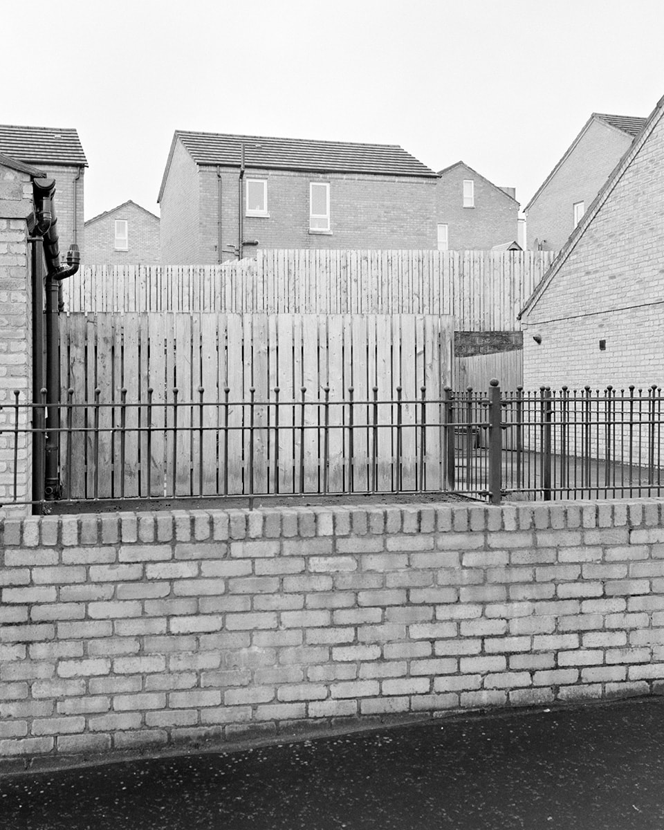
For my personal investigation, I am interested in architectural photography. I really enjoy taking photos of buildings and structures and this work by Hèléne Binet and the way she manages to capture the parallel lines and depth beyond that surface that is highlighted by the monotone format of the images. The black and white give the photos a different depth to if it was in colour, and snake the space in the composition more bold and vivid when looking at them. The images in a way look surreal, the spacing and light contrast and the objects photographed look almost unreal due to the texture - smoothness that the objects have. The gradient of the colours all blend into each other which usually isn’t the case with my photos as there are lots of different colours which sometimes don’t blend together. Binet’s work has inspired me to take my photos in response to her in black and white and to also make my photos make people not recognise where I took the photo or what building it is of.
For my personal investigation, I am interested in architectural photography. I really enjoy taking photos of buildings and structures and this work by Hèléne Binet and the way she manages to capture the parallel lines and depth beyond that surface that is highlighted by the monotone format of the images. The black and white give the photos a different depth to if it was in colour, and snake the space in the composition more bold and vivid when looking at them. The images in a way look surreal, the spacing and light contrast and the objects photographed look almost unreal due to the texture - smoothness that the objects have. The gradient of the colours all blend into each other which usually isn’t the case with my photos as there are lots of different colours which sometimes don’t blend together. Binet’s work has inspired me to take my photos in response to her in black and white and to also make my photos make people not recognise where I took the photo or what building it is of.


Tilt shift lens
‘A tilt shift lens is a lens in which the optics can be tilted and/or shifted in relation to the image sensor. They also rotate to allow the lens to tilt/shift in a wide variety of directions’.
A tilt shift lens is extremely useful when taking photos of buildings and landscapes as the lens changes position in order to give me more control over the depth of the image and creates an illusion that the photo was taken in a different place than where the camera actually took it . By using this lens, the lines and shapes in my photos will become more parallel and symmetrical which only enhances the photo and the features captured. The tilt/shift lens can also make a photo look like it’s in motion even though it is stationary.
Julius Shulman
Julius Shulman was an American architectural photographer who was especially known for his comprehensive documentation of Mid -Century modern architecture and urban development which is a genre of photography I am interested in and want to explore further. He worked on black and white film to reduce his subjects to “ clean, essential lines and shapes”. More than 70,000 of his photographs are in the J Paul Getty museum in LA which showcase his architectural contemporary photography. Shulmans best known work is the “Case Study House #22” in 1960 in which he photographed the aesthetic of the architecture around the world and his most iconic photos come from this series such as the Pierre Koenig and Frank Lloyd Wright which have been published and showcased numerous times.
By adding people in his architectural photos, the photos are given a more humanistic touch and warmth in comparison as opposed to having nobody in them. The lighting in the first photo below illuminates the women and sofas immediately drawing my attention to them and the lights of the city below . Shulmans work conveyed the message that architectural photography is to be considered as an ‘independent art form’ and it was his photography that brought modern architecture into the American mainstream through the perception and understanding of the buildings shown in his photos.
By adding people in his architectural photos, the photos are given a more humanistic touch and warmth in comparison as opposed to having nobody in them. The lighting in the first photo below illuminates the women and sofas immediately drawing my attention to them and the lights of the city below . Shulmans work conveyed the message that architectural photography is to be considered as an ‘independent art form’ and it was his photography that brought modern architecture into the American mainstream through the perception and understanding of the buildings shown in his photos.


My response......


WWW: The black and white tones make the structures and lines more prominent and bold. What and where the photo is taken isn't completely obvious at first.
EBI: use a camera instead of phone so I can focus and adjust the focal length by myself instead of it being done automatically, and how close I am to what I am photographing - zooming in and out and instead of doing that moving myself to be closer or further away from the photo so it will come out more in focus and clearer.
EBI: use a camera instead of phone so I can focus and adjust the focal length by myself instead of it being done automatically, and how close I am to what I am photographing - zooming in and out and instead of doing that moving myself to be closer or further away from the photo so it will come out more in focus and clearer.
Twin Lens Reflex


The design is older than the SLR and was one of the most popular 'advanced' types of camera prior to the WWII. The camera body is divided in two halves and uses two entirely separate halves and uses two lengths of identical focal length . The top focuses on forming an image which is 45 ° fixed mirror onto a full size focusing screen on the top of the camera. Only the bottom lens is fitted with diaphragm and bladed shutter which forms the image directly onto the film.
The focusing screen of TLR gives more image information than a direct vision viewfinder camera but without the cost and complexity of an SLR. Whilst the camera is mechanically simple, you can observe the image on the focusing screen at any time - even during the exposure. However, it appears reversed (left to right) and a parralex error between the slightly differing viewpoints of the two lenses causes some inaccuracies , especially in close up. The TLR is bulky in comparison to its picture size so can at times be uncomfortable to carry around.
I learnt how to use this camera today and took some photos on film which I then developed in the darkroom. The images that I took and were produced are below:


Turning my photos into a book
Using some of the photographs that I took in response to Binet, I printed two images out and then photocopied them onto each other multiple times but in different compositions and overlays and used tracing paper to try and place the image on the window and take photos of buildings but through the tracing paper but the tracing paper against the window didn't allow me to see past it so the experiment didn't really work. Instead, I printed more of my images on top of each other and made a book which I made a flip through video to show all the images that I have created:
