Bruggé photoshoot
On my trip to Bruggé, Belgium, I thought about trying to incorporate styles from Helene Binet and Julius Shulman as I loved their monochrome format but also how they composed their photographs. Both artists focus on clean, sharp lines and shapes but Binet focuses more zoomed in whilst Shulman has many photos from a more zoomed out perspective. Whilst away, I managed to visit multiple churches which had extremely detailed and intricate ceiling designs that are shown in my photos below. I took a mixture of close up and zoomed out photos to try and find out which looked better with the styles of photographs I was taking. I really enjoyed these photos and found multiple opportunities to capture beautiful buildings when walking around the city. This helped me to see the way in which the design and structure of buildings have changed over the years and also how they differ to the ones in the UK.


Saatchi Gallery and V&A
|
|


|
|


|
|


|
|


|
|


|
|


Photoshoot 2
In this photoshoot, I tried to take photos which were more close up and by moving closer to the subject instead of zooming in on my camera. I found that in this set of photographs I focused more on the close up shots and this has helped me in finding which style I prefer to display my photos in.


Summer work
Matthew Garbutt
Matthew is a Brighton based photographer who takes photos of the urban landscapes wherever he is. His compositions focus on forms, patterns, colours and textures band show how he can 'find beauty' within the built environment. His photos have helped me to see different angles and perspectives but also what he captures in his frame varies. His photos focus on symmetry, shapes and lines on the 'built landscape' and the angles he takes his photographs from makes them look different from what we pass by every day and enhances the shapes and construction of the buildings which I really like.


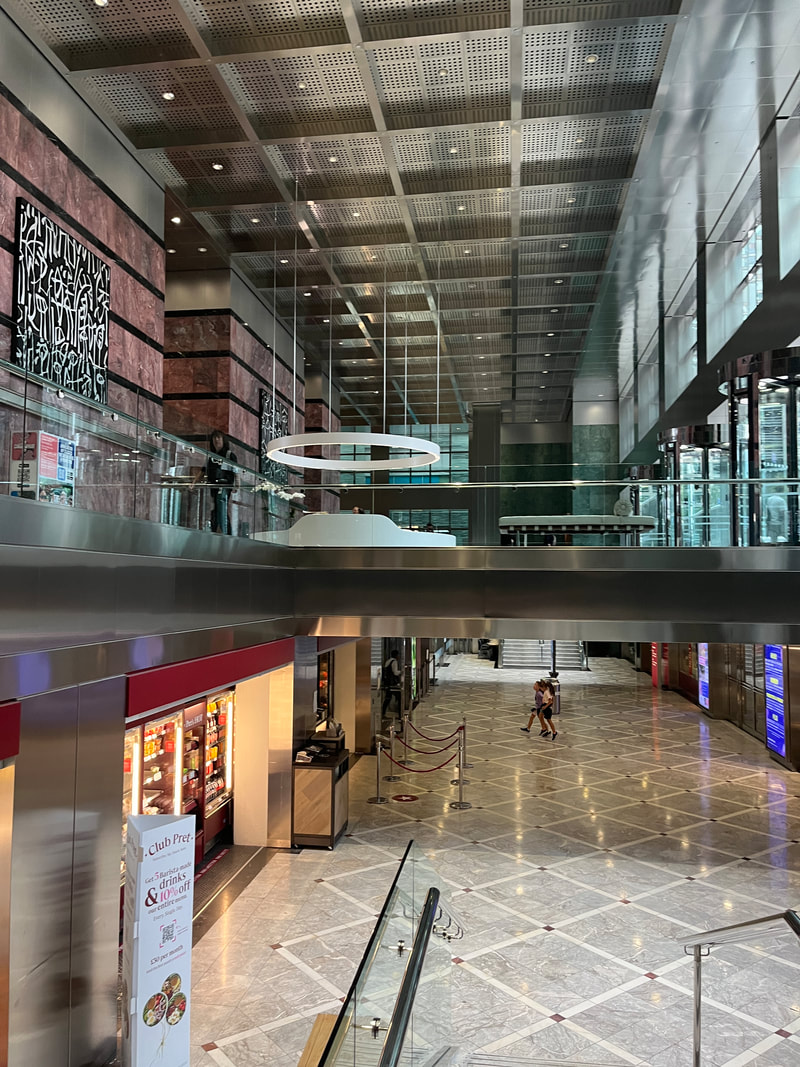


This summer I was looking for opportunities to take photos of the interior and exterior of buildings when I went out to see castles, restaurants and whilst walking around London . I was trying to take my photos more close up instead of zooming in and this is something I still need to work on in my next photoshoot. I want to take photos without zooming in and taking a photo of a small part of the inside or outside of a building that I like and compare that photo to the whole building - a larger scale of what I photographed and see if what I took is clearly visible or hidden due to the way I captured it. Over the summer I have been looking at the work of Maximilian Haidacher and Matthew Garbutt. Haidacher's work is symmetrical and features mainly straight lines - his work is very neat and his photographs are taken taken from a central point of view which I haven't been doing much of recently. I particularly like the photograph taken in a cathedral and the light is reflecting onto the stained glass on the ceiling illuminating the room. I really like this photo because of the way the glass lightens the pathway so I can see what is at the end. The lighting in my photos need to be improved and looking at Haidacher's work has helped me to know where to position myself when taking my next photographs. I have recently been taking my photos in colour - my experimenting between colour and monochrome photos is ongoing.
Maximillian Haidacher
Maximillian Haidacher is a visual and freelance photographer who focuses on architectural and urban landscapes. His photographs show how we can 'reshape and utilise space in our civilised world' whilst leaving out the creators - humans. His work illustrates the impact that humanity has on the world, the footprints of humans and the presence of humans that is always around us. Haidacher describes his work as 'having a touch of dreariness and abandonment'. The theme of abandonment is something I would like to further incorporate in my investigation. When photographing my architectural landscapes I find that the photo looks completely different if there are no people in the frame compared to if there is.


Exhibition Visit
On this visit, I went to the National Portrait Gallery and looked at the work displayed inside. I particularly liked the sculptures that were shown as well as the female artists wall which showcased women and their impact to the art world. I also looked at the 'Life and Colour 'exhibition by Yevonde. This exhibition showcased a mix of portraits and still life works which were produced during Yevonde's sixty year career. Her work and displaying it in this gallery has the aim to increase and enhance the representation of women in art and in the gallery.


Diptychs + Triptychs
Today we printed out around 20 of our images and arranged them into diptychs and triptychs. This has helped me see how my photographs link and contrast and how an external viewer may see my photographs without context. Making diptychs and triptychs allowed me to arrange my photos together which were from different photoshoots and seeing how they differ and relate. Most diptychs were from two different sets of photographs and highlight how similar and connected my photographs are without me realising. Some photos fit together as soon as I placed them next to each other. The colours, subject and composition compliment each other and match . In some diptychs I paired together because of the lines in the photo. When placed next to each other, the lines look as if it is being continued in the adjacent photo, which linked the images together.


Making Diptychs
Using the 'Freeform' app on my phone, I selected two images at a time and then arranged them next to each other and positioning next to each other. This way of making diptychs are fast and easy to do so I can make multiple in a short space of time. Below are the diptychs that I have made:


The diptychs made above include photographs taken in both Central London and Rochester. I chose these photographs to compare the lines and shapes highlighted and to showcase the similarities and differences in the photos that I take. The fifth diptych is one of my favourites due to the lines of the building and how it gives the visual that the diagonal line is going through into the second photo which connects them together.These diptychs are put together mainly because of the similarity in shapes, lines, subjects and how these vary and relate. What I like about these photos is how the lines connect from the first to second photo but also how different the photos look next to each other. If I were to do this again then I would choose more photographs which match a bit better than the ones selected above.
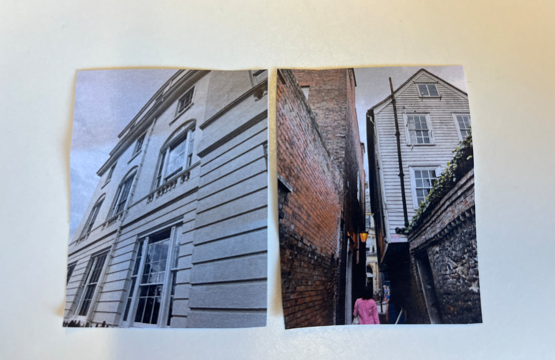
Favourite Diptych
This is my favourite diptych because of the similarity in niches and the way that in the past, statues like on the right were placed in the window spaces inside houses showing a connection between the images. These photos also contrast new and old, past and present as the image on the left is Rochester Castle more than 900 years ago and shows the history of England and how castles were made and maintained and the types of materials used to build it and how it has stayed in society. The photo on the left was by an artist quite recently and is an example of the types of art that were seen in castles and prominent places as a way of marking history and important figures. I love these photos together because of the way they connect with each other but also the way they differ and showcase different time periods.
Favourite Triptych
This is my favourite triptych because of the way they all interconnect in terms of architecture and how modern they all are. The photos have similar shapes made by the window panes : squares and rectangles which frame the outside and show symmetry. The lines in each photo connect with the photo next to it and integrate the three photographs together.
Painting with Light exhibition
While 'Painting with Light' may not directly link with my personal investigation, this exhibition has greatly inspired. As I explored the photographs and delved deeper into the artistic techniques showcased by the featured artists, I found myself inspired by their innovative approaches to framing and presentation.
The thoughtful use of colour and composition, in particular, gave new ideas and insights that I wanted to incorporate into my own photography. This inspiration was vividly reflected in my following photoshoot in Greenwich, where I found myself experimenting with different framing techniques and embracing a more dynamic approach to colour and space.
Initially, I may have perceived the exhibition as completely unrelated to my investigation. However, upon reflection, I've come to realise the profound impact it has had on shaping my creative vision. The composition and colours showcased in the artwork, has inspired my photographs in a way I didn't think about.
Greenwich dérive


|
From the photoshoot, this particular image stands out as my favourite, due to its perspective: looking upward. The convergence of walls and windows framing the shot, juxtaposed against the concrete colours, accentuate the prominence of the blue sky, giving the photo a striking visual contrast.
In my photographs, I usually find myself drawn to opportunities to capture scenes from elevated vantage points or viewpoints looking downward. However, this particular image resonates with me on a deeper level due to its unique composition. The gradual diminution of the rectangular shapes as the building ascends, combined with the symmetrical arrangement of walls and windows on either side, instills the photo with a sense of uniform and linearity, enhancing its visual appeal. Overall, the combination of the upward perspective, the interplay of shapes and symmetry, and the contrast between the concrete surroundings and the expansive sky that makes this photograph my favourite. |
Tom Hunter
Tom Hunter is a British artist who is based in Hackney and works with both film and photography. Hunter's work is as a reflection of the tapestry of life in this urban landscape.
One of his seminal projects, 'The Ghetto', is a testament to his standing commitment to social justice and community advocacy. Produced between 1993-94, this evocative series shows his views against the impending redevelopment of the area by the council, a move that threatened to displace longstanding residents and erode the cultural fabric of the neighborhood. Through his lens, Hunter captured the essence of Hackney's vibrant community, the faces and stories of his friends and neighbors in an act of defiance against gentrification and urban renewal.
The photographs featured in 'The Ghetto' are not merely snapshots of a neighborhood in transition; they emphasise the resilience and spirit of a community fighting to preserve its identity and heritage. Inspired by Hunter's dedication to his local community, I am motivated to go on my next photoshoot closer to home, combining my work with a sense of personal connection and authenticity that mirrors the intimate portraits captured in 'The Ghetto'. I hope to capture the essence of my community and contribute to the ongoing dialogue surrounding urban change and social justice.
Keld helmer-peterson
Keld Helmer-Petersen stands as an influential figure of Danish photography, his lens capturing modern architecture and industrial landscapes with unparalleled depth and insight. In his hometown, Copenhagen, Helmer-Petersen drew inspiration from the urban tapestry surrounding him, particularly the industrial and port districts.
He is known for his ability to transform mundane architectural details and everyday scenes into compositions of unparalleled beauty. His photographs, are characterised by attention to detail and planned composition, giving us timeless snapshots of a bygone era.
While initially drawn to the stark contrasts and timeless elegance of black and white photography, Helmer-Petersen's artistic journey soon led him to explore new horizons. Through experimentation and innovation, he explored graphic and abstract photography, pushing the boundaries of traditional photographic techniques.
One of his most known works were in the realm of "camera-less" photography, where he questioned the conventional use of a camera and created photograms in the darkroom. These experiments, challenged the very essence of what constitutes a photograph, pushing the boundaries of the medium in bold and unprecedented ways.
Helmer-Petersen's legacy endures as a testament to the power of artistic exploration and innovation. His pioneering spirit continues to inspire photographers and artists alike to push the boundaries of their craft, reminding us of the boundless possibilities that lie at the intersection of art and technology.
Experimenting
Using photoshop to layer my photos, I will use these to make a concertina book to display some of my architectural photos. Below is the process in which I experimented in overlaying my photos. I pasted my photographs on top of each other and then chose which effect I thought looked best in the layering of the two images - these are shown below :

|

|
|


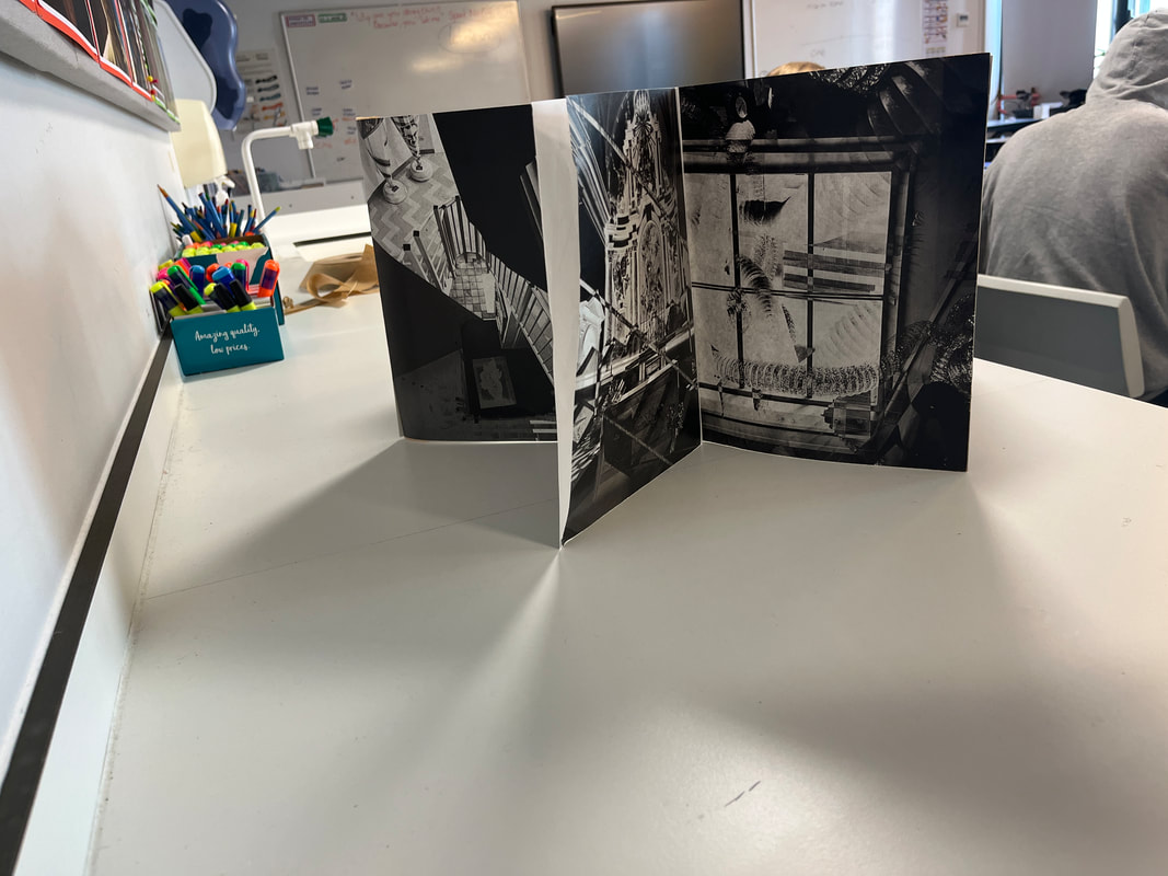
Using these photoshop experiments above, I printed them out onto A3 paper and decided to create a book. The photographs are quite dense and so having an image on every page would be too much so I decided to make my photos into a concertina type booklet instead. I used some water activated tape to stick the ends of the pages together so all my photos would be connected and linked and then arranged it into different shapes. The representation of space within architecture was shown through my concertina book which looked like a mini structure - building. To further portray this, I took photos of my booklet outside in front of the school buildings which are below:
|
|


|
|


Below is a flip through of my photobook which I rephotographed outside :
Using photos from my photobook, I printed them out in different sizes and displayed them in different arrangements and photographed them at different angles and positions on a wall. I used a frame in some images but next time I do this I would like to have more of a variety of photo sizes and to use more frames to make the photos stand out more and make the installations different from just arranging photos in different arrangements.


I was unhappy with the colour balance of my photos as you can see the reflection of the floor in most images so I used photoshop to adjust the colour balance and highlights to a more neutral background. Below are examples of some photos that I have edited in photoshop :


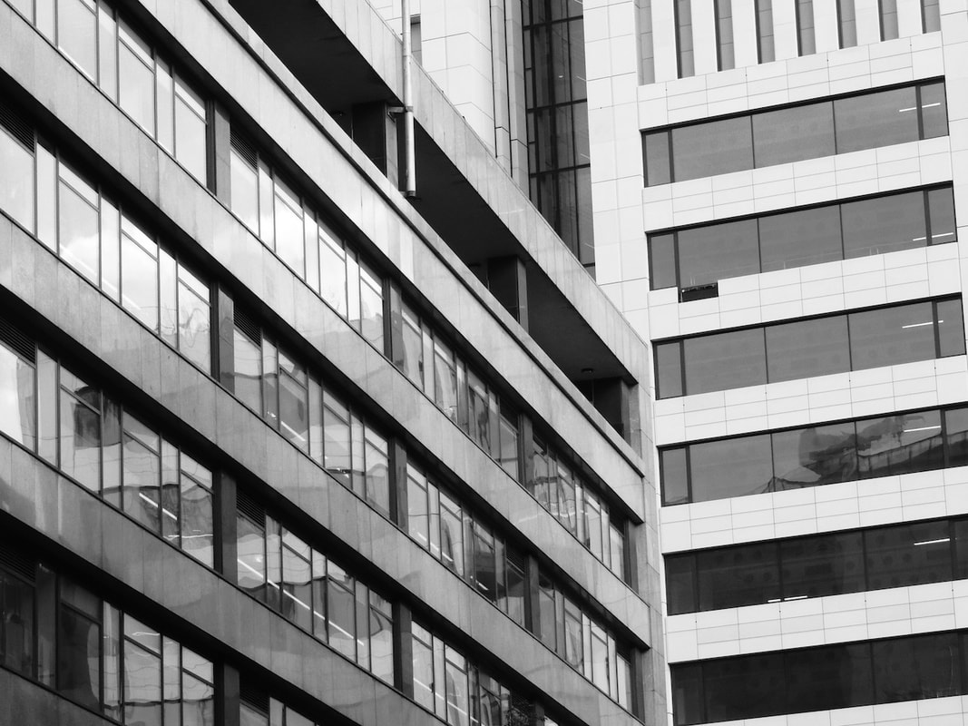
On a trip to the Barbican and Southbank, I was able to photograph a couple brutalist structures and take photos from different angles to showcase the space and shapes that can be seen. Most are in black and white as I prefer how much detail can be seen and helps the viewer to focus on the buildings rather than what's going on around it. Although the buildings are tall and don't have much surrounding them, the monochromatic format allows me to emphasise the structure's different shapes, lines and see how this creates architectural space.


|
|


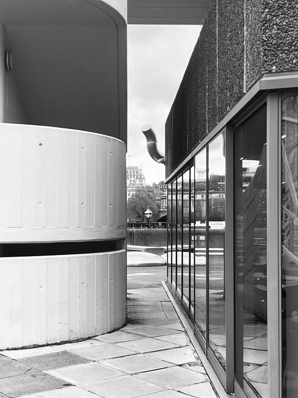


This photoshoot was extremely successful , showing a diverse array of photographs captured from various perspectives—both up close and from a distance. In the architectural landscape, I found myself drawn to the interplay of lines, shapes, and textures in these brutalist structures. It offered multiple opportunities to explore the theme of architecture and abstract forms.
Opting predominantly for black and white imagery, I aimed to focus on capturing the details and geometric precision of the buildings. This monochromatic format emphasised the crisp lines and bold shapes, allowing viewers to delve deeper into the architectural nuances without the distraction of colour or background elements. The result was a series of images that focused attention on the shapes and details of the structures themselves.
Among the collection, there are several images that stand out to me as particularly successful in conveying my chosen theme. These images, predominantly close-ups, possess a striking sense of abstraction and minimalism, allowing viewers to immerse themselves fully in the raw essence of the architecture. Each photograph serves as a testament to the power of visual storytelling, inviting viewers to explore the intersection of form and function in these brutalist structures.
Using Photoshop, I layered my favourite photographs on top of each other to show the variety of shapes and space seen in buildings and used different layering effects to merge the images together. I did most in black and white as I felt like it emphasised the negative space, making it more prominent. The monochromatic format that I took my images in make it easier to see the shapes and lines on buildings, showing how vast they look in comparison to everything around them.


Heyward and Photographers Gallery


Daido Moriyama
Daido Moriyama stands as a luminary in Japanese photography, known for his captivating black and white street images. His distinctive style embodies raw contrasts, gritty textures, and dynamic movements— which I loved.
Moriyama's mastery of blurred imagery is particularly inspiring. On my personal exploration of photography, his blurred compositions served as an inspiration, offering invaluable insights into refining my own techniques for capturing motion and atmosphere.
One notable aspect of Moriyama's process is his use of Fujichrome paper for printing. His photographs are heightened with colour saturation and contrast, elevating his work to a level of visual intensity that is both striking and unforgettable. It's this distinctive aesthetic quality that sets his work apart and consistently draws me in, sparking my own creative aspirations and pushing me to explore new dimensions in my photographic journey.


Making Day
Using my most successful images over the course of the past few months that I had layered on Photoshop, I printed them out on A3 card and then used a scalpel to cut shapes onto my photos. After doing this, I arranged all of my photos into different compositions and re - photographed them to create sculptures which can be seen below. Overall, I find this process to be highly successful. It enabled me to craft multiple compositions from each printed photograph. The strategic use of different shapes and cuts in the card unveiled hidden elements, adding depth and intrigue to the imagery—a creative aspect that I particularly liked.
|
|
I made this using IMovie and added the photographs that I have been using for the mini sculpture above.
I then set it to pan so not all of the image would be seen and shown at once and added some sounds from an archive of a variety of sounds. |
